

JP Harrisons Rebrand
JP Harrisons initially approached us to review their website. However, during our discovery session and subsequent audit, it became clear there was a deeper issue - a lack of confidence in the existing brand. What started as a website project quickly evolved into something more strategic. The desire for a new site naturally aligned with the need for a full rebrand - a step many businesses overlook.
Branding isn’t just a visual layer; it directly shapes how a website looks, feels, and performs. Without strong foundations, even the best-designed websites will struggle to deliver impact.

Our Approach
We took a three-step approach when developing the brands identity, colour palette and typography:
-
We reviewed the existing branding and compared it to industry standards to identify strengths, opportunities, and how its messaging and colour can better express the brand’s personality and voice.
-
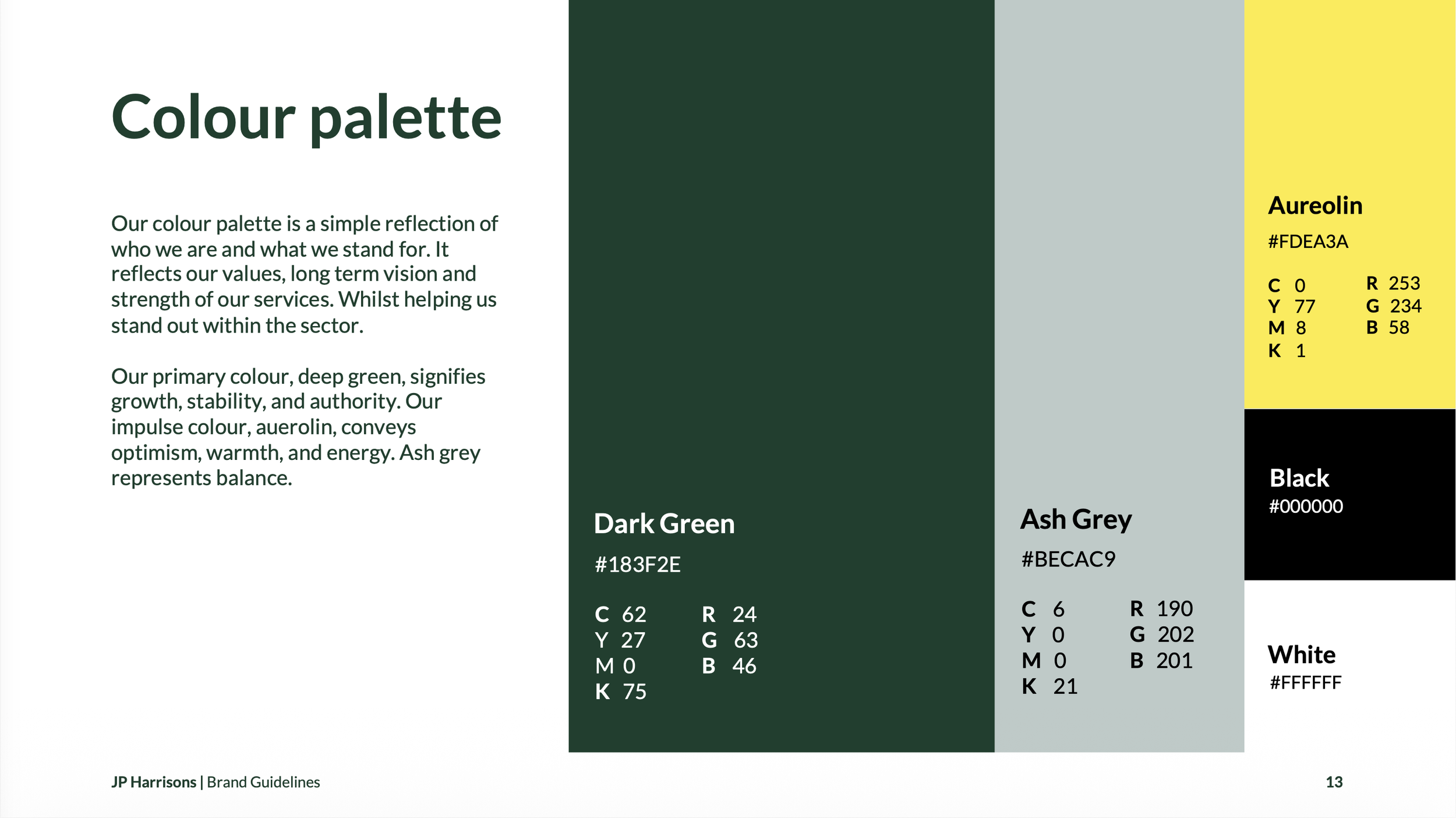
We took a deep dive into the competitors and industry to identify trends, gaps, and how colour is used to express brand personality. We also explored the psychological impact of colour to ensure the palette stands out with clear differentiation.
-
We applied colour psychology and theory to build palettes that resonate both emotionally and visually. We also researched industry trends and global influences to ensure the brand remains fresh, relevant, and appealing.
The Palette
The Logo

From this
A typical AI generated logo, with a lack of..

To this
A clean and professional logo..